The Pantone Color of the Year 2023 will soon be announced!
As the evenings get darker and shops are dressed for Christmas; at VeriVide our thoughts turn to wondering which colour will be chosen for the Pantone Color of the Year.
Usually, the announcement is made on the 1st Thursday in December, however this year that is the 1st of the month so we may have to wait until the 8th December.
Since 2000 Pantone Color Institute™ has announced a Color of the Year, the selection process has involved careful trend analysis and thoughtful consideration, looking at multiple colour influences from technology to art, films to the natural world and its impact across the globe.
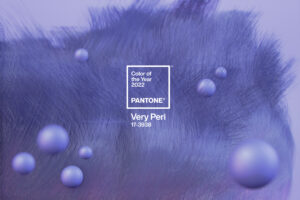
COY 2022 Veri Peri 17-3938
Last year Pantone surprised everyone by creating a new colour to add to their Fashion, Home + Interiors range and announcing Veri Peri 17-3938 as the Color of the Year for 2022.
This was to signify a time of transition and change. As Leatrice Eiseman, Executive Director, Pantone Color Institute explained “Encompassing the qualities of the blues, yet at the same time possessing a violet-red undertone, PANTONE 17-3938 Very Peri displays a spritely, joyous attitude and dynamic presence that encourages courageous creativity and imaginative expression.”
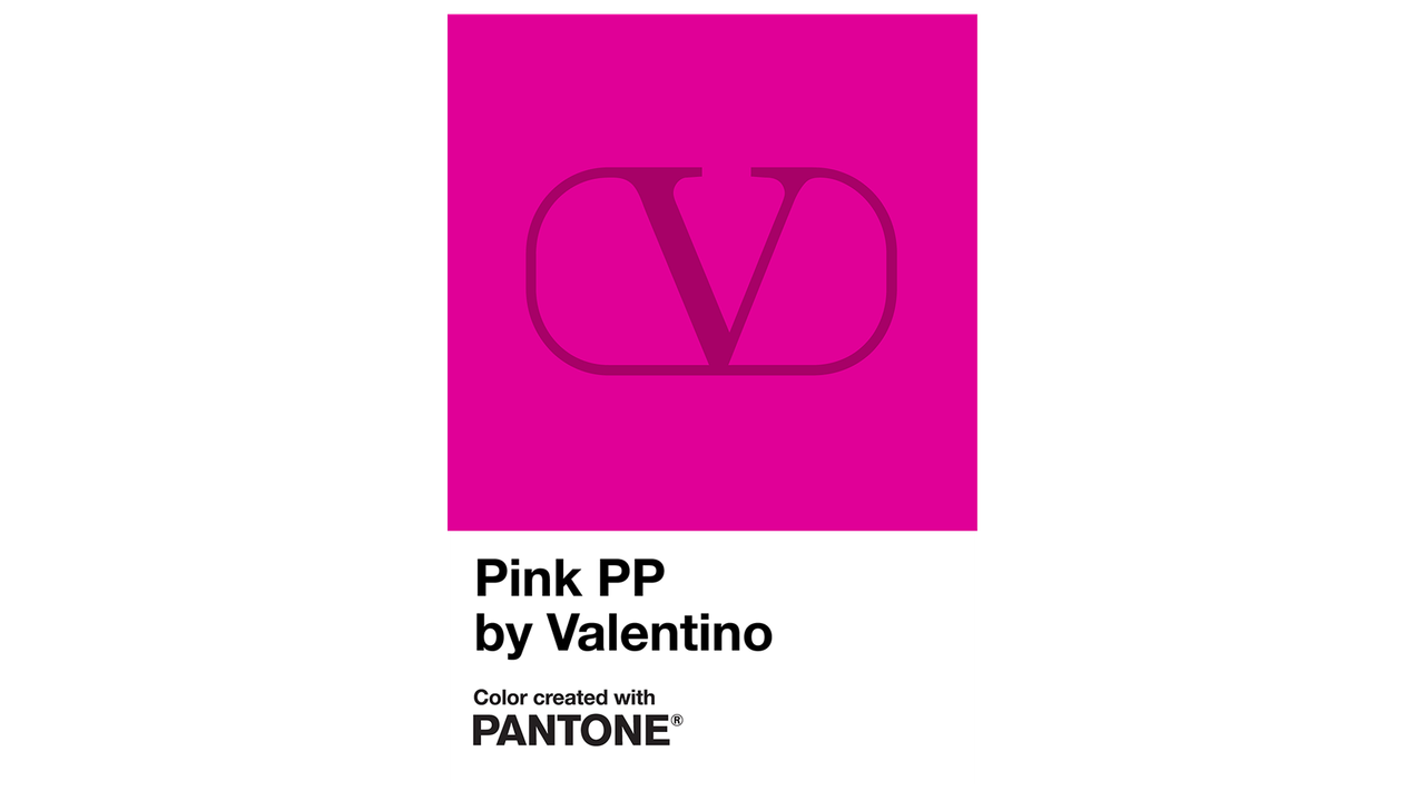
Of course, Valentino Pink PP is an exclusive custom colour and so cannot be the Pantone Color of the Year 2023, nor will it be included in the Pantone colour libraries for general use.
So, what will be the Color of the Year for 2023?
The recent trend forecasts released for Spring and Summer 2023 at both the London and New York fashion Weeks, usually give us a good idea of what the COTY might be. This time, there are no overlapping colours between the London and New York Colour Palettes – Pantone are keeping us guessing! However, there are similarities in the shades on both palettes with an emphasis on dynamic bright shades offset by a few calm tints and tones.
With this in mind, let’s look at some of the Pantone Fashion, Home + Interior colours and predict what the Pantone Color of the Year 2023 will be!
Pinks and Reds
Valentino was not the only designer to be showing vibrant pinks and reds for 2023! Perhaps Pantone will choose one of these colours to represent energy and intensity and our need for brightness and vibrant positivity.
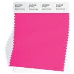
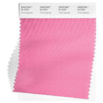
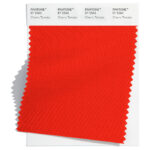
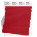
Possibly we will begin next year with Beetroot Purple 18-2143, a vibrant fuchsia or maybe the more subtle Pink Cosmos 16-2122 which is beautiful contrast to other hues. Or maybe a dramatic Fiery Red 18-1664 or Cherry Tomato 17-1563, both reds which call out for attention.
- Beetroot Purple 18-2143
- Pink Cosmos 16-2122
- Cherry Tomato 17-1563
- Fiery Red 18-1664
Greens
Continuing the themes of nature and sustainability, green is still a shade not to be ignored in 2023.
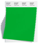
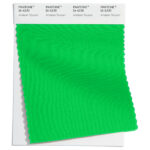
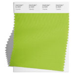
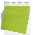
From the traditional Classic Green 16-6340, nourishing and with health giving qualities, to the vibrant and exotic Andean Toucan 16-6230 TN . Or it could be sharp and acidic Titanite 16-0229 or maybe the similarly lively Love Bird 13-0443 ? Both of these are yellow green tones, evocative of Spring.
- Classic Green 16-6340
- Andean Toucan 16-6230 TN
- Titanite 16-0229
- Love Bird 13-0443
Yellows and Oranges
Only two years ago Pantone selected a yellow as the COY 2021, PANTONE 13-0647 Illuminating was a cheery yellow to offer warmth and spirit in times of uncertainty. It is unlikely then that Pantone will select yellow again as usually the hues do not repeat more often than every four years, however the prevalence of warm sunshine yellows alongside tangy oranges for Spring 2023 means it cannot be discounted.
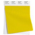
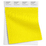
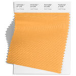
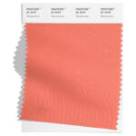
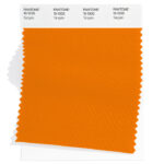
Will it be Blazing Yellow 12-0643 a radiant beam of sunshine or Empire Yellow 14-0756, a luminescent yellow that radiates joyfulness? Instead it could be Tangelo 15-1335, a tangy, tasty vitamin enriched orange, fruity Iced Mango 14-1140 or Persimmon 16-1544, a silky shade of coral.
- Empire Yellow 14-0756
- Blazing Yellow 12-0643
- Iced Mango 14-1140
- Persimmon 16-1544
- Tangelo 15-1335
Blues
In 2020 Classic Blue 19-4052 was Color of the Year, classic by name and classic by nature this shade of blue was chosen to bring calmness, protection and stability.
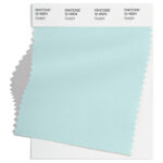
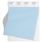
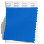
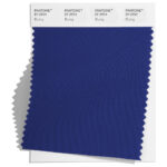
In contrast the blues predicted to be used in 2023 are more brilliant regardless of whether they are light shades of sky blue such as Airy Blue 14-4122 and Skylight 12-4604 or more saturated ones like Electric Blue Lemonade 18-4245 TN or Bluing 19-3954 which has been a popular choice with designers. There hasn’t been a bright blue selected since 2008 when Blue Iris 18-3943 was chosen so maybe this year will be a bright blue year?
- Skylight 12-4604
- Airy Blue 14-4122
- Electric Blue Lemonade 18-4245 TN
- Bluing 19-3954
But maybe Pantone will surprise us again and will pick a different shade entirely! What do you think will be the Color of the Year 2023?
Here are some of the past Colors of the Year, does this help you with your prediction? Let us know what you think the Pantone Color of the Year 2023 might be!
Keep your eyes peeled for the big reveal coming very soon!
About the Pantone Color Institute™
The Pantone Color Institute is the business unit within Pantone that highlights the top seasonal runway colours, selects the Pantone Color of the Year, forecasts global color trends, and advises companies on colour for product and brand visual identity. Through seasonal trend forecasts, colour psychology, and colour consulting, the Pantone Color Institute partners with global brands to effectively leverage the power, psychology, and emotion of colour in their design strategy.
The Pantone Color Institute provides customised colour standards, brand identity, and product colour consulting, as well as trend forecasting inclusive of Pantone Color of the Year, Fashion Runway Color Trend Reports, colour psychology, and more.


