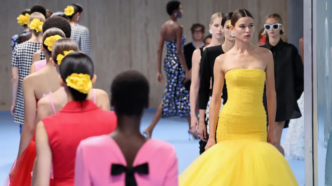
Everyone had a front row seat in Februarys London’s Fashion Week, or should I say, front row sofa. With the ongoing pandemic, this month’s show was to be enjoyed from the comfort of our own homes. Hosted on a virtual platform, the Official LFW Digital Hub, alongside the British Fashion Council’s Fashion Forum podcast, designer diaries and even a Spotify playlist, What Does Fashion Sound Like?
It has been a big year of change for most, but even more so for the fashion industry. This month the London Fashion Week (LFW) will be the first entirely digital show, with digital catwalks only. For most of us, we have swapped the office style, for lounge wear and our trusted dressing gowns. Maybe the odd smart top for that Zoom meeting, but yes, we all know you still have unseen pyjama bottoms on too!
Freedom Fashion
Of course, we are all hoping for a much different autumn and winter this year, with most, if not all the restrictions lifted, so the designs from LFW not only encompass what clothes we need now, but also clothes we will want to go out in, and boy, that is the dream! Hopefully that dream will become the reality by the time these clothes are in store.
The standout colours for Winter/Autumn 2021/2022
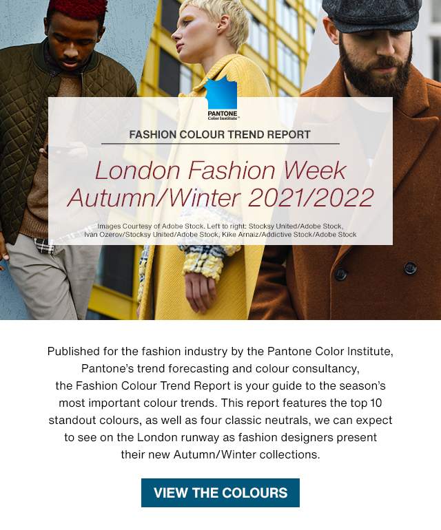
The Pantone Color Institute, the trend forecasting and colour consultancy experts, have produced a report featuring the top ten standout colours as well as four core classics for the autumn/winter season 2021/2022. The colours, as chosen by Pantone, carefully reflect the times, marrying strength with optimism, the focus from the chosen colours of the year. Pantone’s forecasting report for Autumn/Winter 2021/2022, provide guidance for the colours that will stand out later this year and are expected to heavily feature in LFW.
Heartening Hues
The colour combinations bring thoughts of that long-awaited holiday, that most of us are desperate for. The sand between your toes from the beige hues, combined with the grassy green sand dunes. Clear blue skies, a beautiful day at the beach. Ibiza island vibes, chilling to the sound of waves, and the yellow glow, uplifting orange and red skies of the sunset. Not forgetting winery to remind us of that glass of vino whilst we watch the sun go down. Bliss.
Leatrice Eiseman, Executive Director of the Pantone Color Institute, describes the top trend colours as “A colour range of heartening hues reflective of the natural environment in our local surroundings inspires our creative energies and awaken the desire for a replenished perspective on the application of colour”.
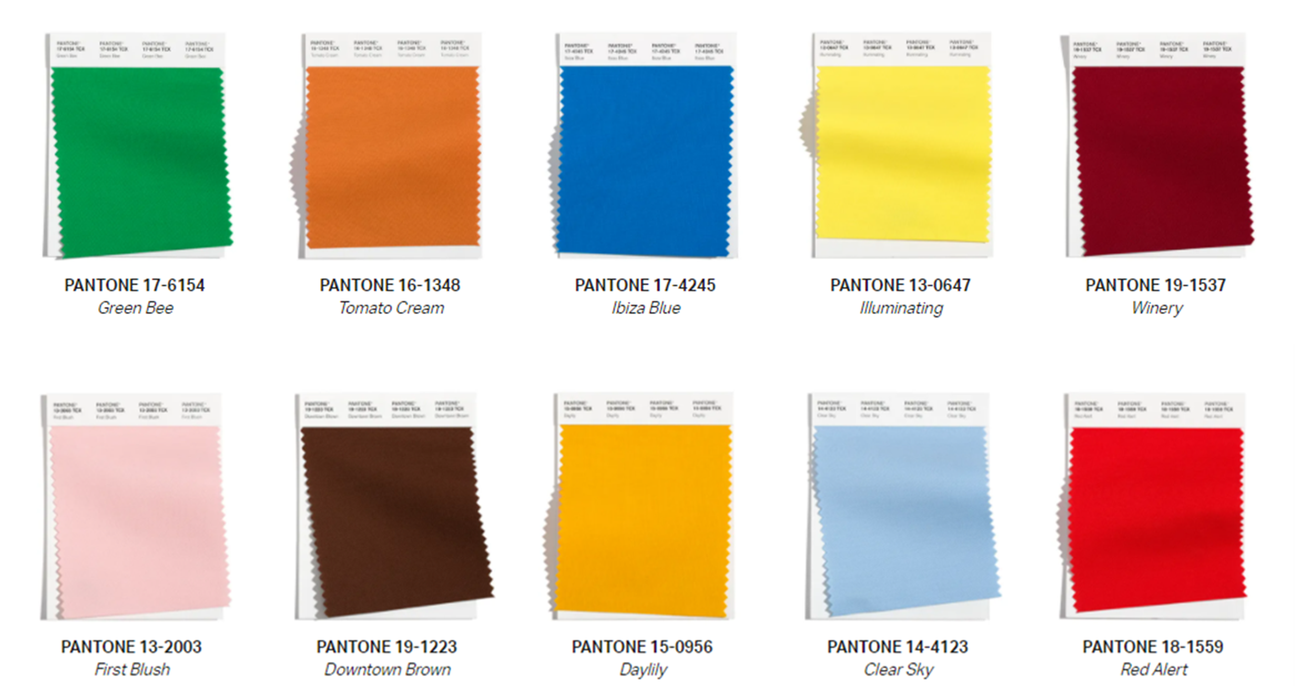
Blending heritage and quirkiness with the new core classics offering a fresh perspective, see below for the top 10 Pantone colour trends.
- A grassy green that perpetuates nature, Green Bee
- Tomato Cream, a warm buttery brown that warms the heart
- A stirring island blue hue that rouses our interest, Ibiza Blue
- Pantone Colour of the Year, Illuminating, a friendly and joyful, optimistic yellow offering the promise of a sunny day
- Robust Winery implies poise and finesse
- A delicate and tender pink, First Blush
- Downtown Brown, a metropolitan brown with a bit of swagger
- An uplifting orange infused with yellow with perennial appeal, Daylily
- Clear Sky, redolent of the cool blue of a cloudless day
- An impactful red with a suggestive presence, Red Alert
The classics: Four core hues whose versatility transcends the seasons.
- Perfectly Pale, a reminiscent of a sandy beach
- Pantone Colour of the Year, Ultimate Grey, quietly assuring and reliable, encouraging composure
- A tasteful green, Olive Branch is a symbol of growth
- After Midnight, an invulnerable black infused blue
A joyful mix of classic colours, with added brights, to bring about the feeling of hope, optimism and a fresh outlook on life; do not hold back on the colour, even in the winter months. Pantone’s Colours of the Year feature of course, with the dramatic contrast of Illuminating and Ultimate grey.
Stay on trend and start to visualise your future ideas, click the colours above and add them to your basket.
New York Fashion Week Autumn/Winter 2021/2022
Not only did Pantone produce a colour forecast for London’s Fashion Week, but also for our friends across the pond, the New York fashion Week (NYFW). Similar tones and hues that embrace and accommodate any situation. Versatile but full of expression, you choose whether to go quirky or sensible, or maybe both?! The quieter tones embrace calm and healing after the chaos of the past year, with a combination of bright pops leading the way; embrace the colours and express a rainbow of hope and joyfulness.
Enduring and exuberant colours come together to create a palette inspiring creativity and reinvention.
- Mykonos Blue, a brisk blue evocative of the Aegean Sea
- Friendly and joyful, an optimistic yellow offering the promise of a sunny day, Illuminating
- Leprechaun is a wondrous green hue emblematic of mythical imps features in Irish folklore
- Vivid Fuchsia Fedora is a flirtatious, bold pink with allure
- An endearing and gentle romantic pink, Pale Rosette
- Adobe is a warm and supportive sundried clay
- A vigorous red with a dynamic presence, Fire Whirl
- Rhodonite is a balancing, blue-based purple that aids in achieving one’s highest potential
- A quiet and restful mid tone blue, Spring Lake
- Root Beer, an herbal brown tone symbolic of the root bark of the sassafras tree
Core hues whose versatility endures.
- Coconut Cream, a thick and rich velvety white
- Quietly assuring and reliable, Ultimate Grey encourages composure
- Soybean is a mild and companionable blond beige
- A tasteful green and symbolic of growth, Olive Branch
Stay on trend and start to visualise your future ideas, click the colours above and add them to your basket. If you have any queries about our Pantone products, please contact Georgina via email pantone@verivide.com or phone 0116 284 7790. Georgina’s expertise and advice can help guide you towards the best products for your designs.

