Even after the unsurprisingly different spring and summer due to the global pandemic, London fashion week is running from 17th to 22nd September and brings together the latest trends in fashion, culture, and technology.
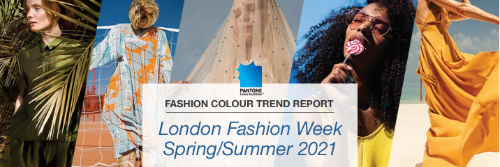
As London Fashion Week will be the hot topic for the next few days and weeks, Pantone’s Fashion Colour Trend Report Spring/Summer 2021 has been released, filling your design with some optimism and hope.
Pantone has created the forecasting report for Spring/ Summer 2021, providing you with guidance and consultation for the colours that will stand out on Spring/Summer 2021 and are expected to steal the show in London Fashion Week.
London Fashion Week remains one of the most anticipated events and is freely accessible to everyone. To keep the social distancing guidelines, this year the British Fashion Council offers the possibility to brands and designers to reach their audience in different ways, showcasing their designs in traditional or digital format as well as both physically and digitally.
Positive Fashion still matters
Fashion is a vital element to our society. What we wear tells the story of who we are or who we want to be and often it reflects the socio-economic situation that we are living.
Collaborating with the scientific and technological field, fashion evolves to have a positive impact on society, the environment and even our health.
As conscious consumerism is still rising, it is expected there will be more and more demand for organic cotton, eco-friendly yarns and fibres, and sustainably resourced textiles. Ultimately, brands and designers will put their weight even more to sustainable solutions after the pandemic, trying to conform better to environmental policies.
Ungendered fashion will be the new trend not only for the business outfit but for casual clothing too, as we have seen brands such as Lee’s to already adopt a dual-gender collection. Gender-neutral designs reflect the younger generations and it is interesting to see if London Fashion Week will focus on that too.
The British Fashion Council envisions a new future of Fashion with brands and designers to raise their voice and collaborate with science to bring a positive change to this world.
The standout colours for Spring/Summer 2021
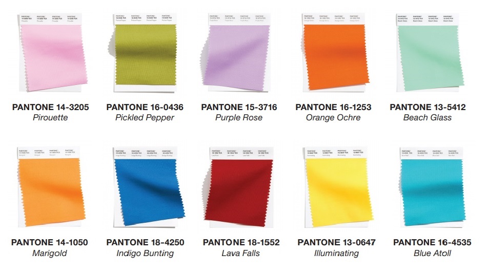
The Pantone Color Institute’s fashion Colour Trend Report Spring/ Summer 2021 was announced on 18th September after the opening of London Fashion Week, forecasting the 10 most market-relevant colours and 5 neutral colours that will stand out on Spring/ Summer 2021.
Colours have not been chosen randomly, as Pantone selects the most frequently used from the Pantone Fashion, Home + Interiors Color System. In times of instability and unpredictability, people need elements of hope and optimism. Thus, we are not surprised that Pantone Colour Experts have picked colours that will give a joyful and invigorating note to your design.
As Leatrice Eiseman, Executive Director of the Pantone Color Institute describes the top trend colours as: “colours that are flexible and can work year-round, colours that amalgamate our desire for comfort and relaxation with energy and determination”.
The upcoming spring and summer season, we will wear turquoise such as the Beach Glass 13-5412 and blue tones such as Blue Atoll 16-4535 and Indigo Bunting 18-4250, reminding us of the sea and the waves.
Inspired from the flowers of springtime, captivating lilac tones such as Purple Rose 15-3716 and Pirouette 14-3205 will elevate our enchantment. Our favourite fiery red tone, the Lava Falls 18-1552, provides energy and confidence.
Orange and yellow tones are always in our mind for summer clothing and Pantone has not disappointed us. The earthy and warm tones of Orange Ochre 16-1253 and Marigold 14-1050 gives a cheerful feeling to your design and the blissful yellow tone of Illuminating 13-0647 brings joy and optimistic look.
We almost forgot the beautiful sweet greenstone of Pickled Pepper 16-0436 which provides flexibility to make amazing colour combinations.
If you have already started to visualise your future ideas, the only thing left is to CLICK the above colours’ links you want and scroll down. The desired swatch will be waiting for you to add it to your basket.

The core neutral hues for Spring/Summer 2021
Make your design more natural and everlasting by using the core neutral for the upcoming season. The following 5 classic but delicate and most demanding neutral hues will create a balance to your design ideas. All you need is to CLICK the colours’ links below you want and scroll down, and the desired swatch card will appear ready for you to add it to the basket.
- Baby’s Breath 11-0202: A tinted off-white lighter than air.
- Macchiato 17-1221: A warm and creamy shade that you will love
- Polar Night 19-4105: A twilight blue for a mystical touch to your appearance
- Ultimate Gray 17-5104: A reliable grey that encourages composure.
- Sphagnum 18-0529: The most emblematic and impressive green colour
Many people wonder why Pantone provides separate London Fashion Week and New York Fashion Week Colour Trend Reports. Well, the two fashion shows have different approach and attitude to the designs. We cannot advise which one of the show weeks is better, as fashion is subjective. Some designers find New York‘s fashion shows more commercial, providing safer options that people could actually wear, whereas London is more provocative, presenting a surreal look and feel. Other fashion commentators think that the New York shows are more conventional, while London Fashion shows have a more nonconformist attitude in the designing and suggestions. What we do know for sure is that both London and New York Colour Trend Reports include inspiring colours.
If you have any query about Pantone products please contact Georgina via email g.boulter@verivide.com or phone 0116 284 7790 to help you decide which Pantone book is the right for you.


