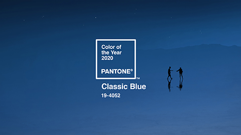
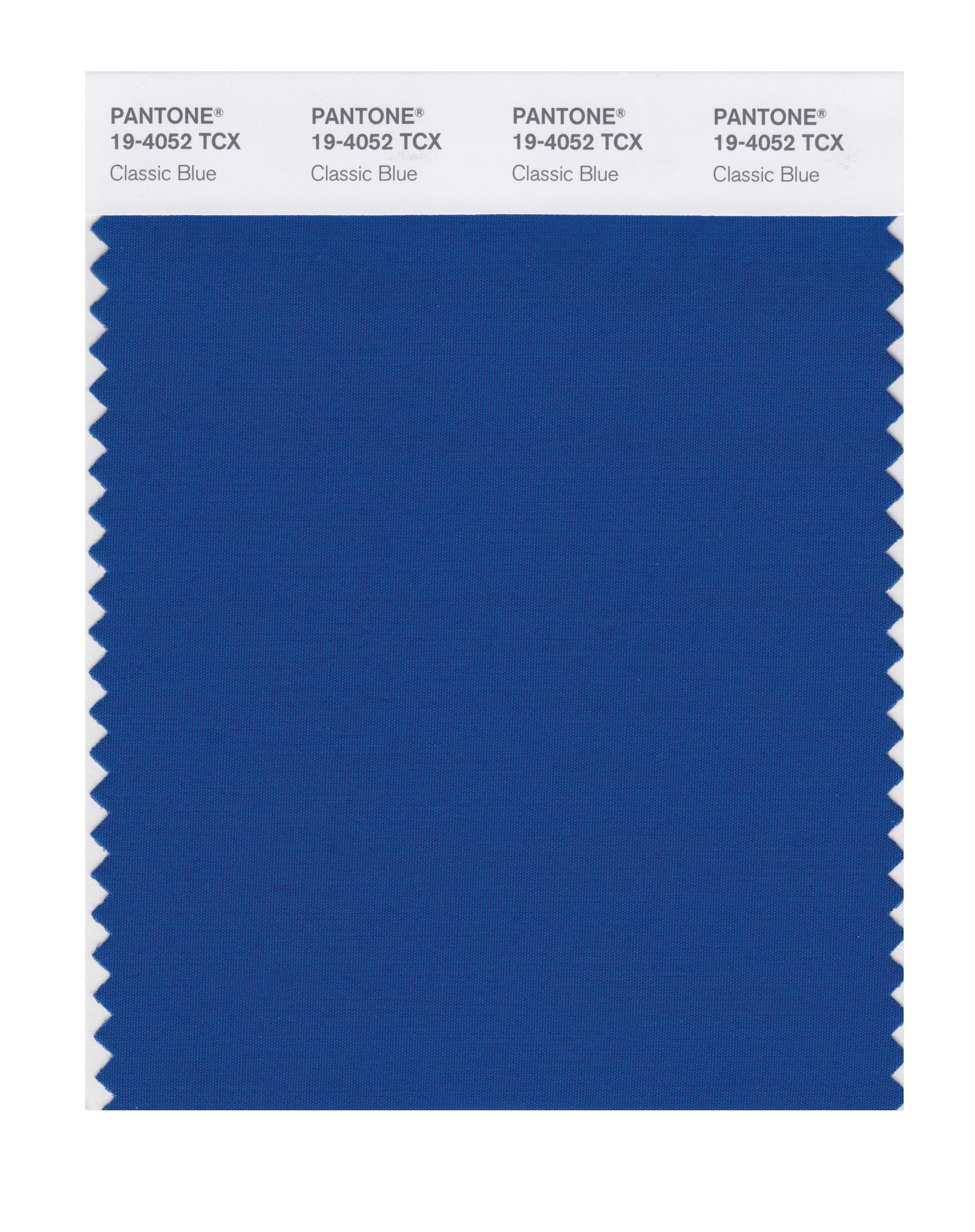
Are you ready to include Classic Blue in your design..? At last, the Pantone Colour of the year 2020 is announced and (guess what) it’s PANTONE 19-4052 Classic Blue!
Following the great success of the vibrant Living Coral 16-1546 colour of the year 2019, Pantone continues to be motivated by nature and the environmental issues that we are dealing with. Continuing with the coastal theme, this time they have been inspired by the sea and the colour of the sky at dusk. Thoughtful and thought provoking but also reliable and reflective Classic Blue 19-4052 is a contrast colour to the recent trends of yellows and oranges. It raises awareness of the influence that natural resources play in the choice of consumers as well as brands and retailers.
Classic Blue is a timeless hue that “brings a sense of peace and tranquillity to the human spirit” (Pantone, 2020), offering also amazing elegant combinations in fashion, swimwear, accessories or interior design.
Why was Classic Blue chosen..?
There are many reasons why Pantone chose this previously unappreciated colour. With the trend away from monochrome and dark neutrals and towards brighter hues in clothing, home and packaging, Classic Blue 19-4052 is destined to be the new Navy.
Living in a constantly unsteady and frenetic environment, we desire more stable and tranquil moments. “We are living in a time that requires trust and faith” as Leatrice Eiseman, Executive Director of the Pantone Color Institute, has confessed.
As our colour expert Georgina guessed correctly back in October “Classic Blue 19-4052 is a more traditional and stable colour which may be popular in this currently unstable World.”
Consumers are getting more and more ethical and conscious about environmental, social and political issues and brands are seeking ways to speak to their hearts, trying to connect emotionally with them and building strong relationships. Pantone didn’t choose this colour randomly, as Classic Blue is a unique and elegant hue that brings calmness, protection and stability. “Non-aggressive and easily relatable” this is “a sincere color imparting a message of honesty, transparency and openness”. According to the Color Psychology, blue creates the feeling of trust and dependability, increasing the consumers’ loyalty levels and that’s the main reason that many brands use blue in their branding.
As a counterpoint to the feelings of stability and protection Classic Blue can also inspire feelings of hope and possibility. PANTONE 19-4052 Classic Blue encourages us to look beyond the obvious to expand our thinking; challenging us to think more deeply, increase our perspective and open the flow of communication.” (Leatrice Eiseman, Executive Director of the Pantone Color Institute).
Blue enhances self-expression and brands use it for effective communication with their consumers…
As expressionists of creativity, designers are influenced by any current socio-political issues. James Cropper’s survey has shown that the political situation and socio discrimination influences the choice of the colour in any kind of design. However, sustainability has a huge influence in 3 out of every 4 designers in the UK, affecting the colour choices as well as the textures they use, exemplifying the fact that Classic Blue 19-4052 is chosen as Pantone Colour of the Year 2020.
The colour blue is considered as idealistic and spiritual. With blue, you have the opportunity to provoke deep feelings, transfer higher ideals and connect more effectively with your audience’s needs and desires.
Brands and retailers try to transform the way that connects with consumers, providing experiences that will be memorable, stimulating consumers’ feelings and senses. People need a different kind of interaction and Pantone Classic Blue 19-4052 is going to be “an immersive and inclusive color experience for all” (Pantone, 2019).
How you can use Pantone Classic Blue in your design..?
Pantone didn’t choose Classic Blue only to sensitise but also because it works so well with bold, neutral or even earth-tone colours. Blue can inspire the design of different industries, offering unconventional and unique combinations. Discover Pantone creative palettes and how you can use them in each industry:
-
For web design
Needless to describe the importance of digital design in social media or in websites! As James Cropper revealed, 1 to 3 designers accept brief requirements for eye-catching, distinctive and consistent web design for social media or web design. Classic blue creates trustful and dependable feelings. Brands can utilise Classic Blue with more nuance shades for their logo but also for their website’s navigation bar or main colour tones in fonts or frameworks. For bold and bright design, you can combine blue and green tones or blue with orange tones.
-
For Fashion and Accessories Design
If you also looked at the Pantone Fashion Colour Trend Report Spring/Summer 2020 you will see that ocean-inspired hues are dominant, shaping the colour trends in fashion, as the coral and pink hues were for the previous year. The intelligent nature of blue is for all seasons and genders, expressing wisdom and confidence. The simplicity of Classic Blue enables you to mix it with many textures, materials and finishes such as metallic, lustrous sheens and woven fabrics. Classic Blue also works extremely well in synthetic fabrics for athleisure and sportswear.
-
For Beauty Design
Experiment with PANTONE 19-4052 Classic Blue for a dramatic statement with eye shadows, nail polish and hair dyes and combine with hues of darker reds, baby pink or a beautiful green in your beauty products. Blue in beauty is easy-to-wear for winter or summer and you can create mystique and sophisticated appearances by using blue in various finishes from glittery and glam to dusty matte.
-
For Graphics, Packaging and hard goods
Because of PANTONE 19-4052 Classic Blue’s relation to the sky at dusk, something we see every day, it maintains a perception of dependability and constancy. A colour we respond to viscerally as being trustworthy, PANTONE 19-4052 Classic Blue is an ideal shade for many applications of graphic design. This is especially true for packaging where PANTONE 19-4052 Classic Blue conveys the message of honesty, credibility and reliability that today’s consumers are connecting to. Including Classic Blue in your packaging adds sophistication especially in combination with speciality metallics.
-
For Interior Décor and Furnishings
Pantone predicted the increased use in deep blue tones for interiors in the aquatic-themed View Colour Planner for Spring/Summer 2020 entitled The Sea This was also revealed by Laurie Pressman, Vice President of Pantone Color Institute Sourcing, at Magic as reported by Freshome.
Offering the promise of protection PANTONE 19-4052 Classic Blue is a favourite for home interiors. Creating a stable foundation from which to build, PANTONE 19-4052 Classic Blue injects creative confidence into interiors, transforming a space through unique colour combinations and tonal statements. Easily applied across so many different materials, textures and finishes, Classic Blue 19-4052 is a dependable blue that can take you in so many different directions. It expresses timelessness, tradition and elegance when used in velvets and upholstery as well as unexpected boldness in paints effects on hard goods.
How do I explore Pantone Classic Blue even further?
We’ve given you an insight and a taste of Pantone’s Colour of the Year 2020, but you want to know more about Classic Blue 19-4052? That’s easy!
The best way is to experience it for yourself, and there are various ways for you to get your hands on the Colour of the Year 2020:
- Pantone SMART Colour Swatch Card
- Cotton Swatch Library
- Cotton Chip Set
- Cotton Planner
- Paper Traveler
- Cotton Passport
- FHI Colour Specifier and Guide Set
- Individual Plastic Chips
There’s so much more for you to browse at our online shop. If you have any questions, please contact us via email at pantone@verivide.com or telephone on +44 (0)116 284 7790.
About Pantone and the Pantone Color Institute
Pantone LLC Incorporated is the global colour authority and provider of professional colour standards for the design industries.
Pantone products have encouraged colourful exploration and expressions of creativity from inspiration to implementation for more than 50 years.
The colour selected as our Pantone Colour of the Year 2020 was taken from the Pantone Fashion, Home + Interiors Color System, the most widely used and recognised colour standards system for fashion, textile, home, and interior design.


