Manufacturers and designers use colour references and colour standards such as Pantone to select and specify colour by a reference number which allows them to predict the appearance of the colour after printing.
The Challenge
By using existing colour ranges, designers save precious time in the first stage of colour specification. However, colour is rarely reproduced exactly on a printed material as it is presented on the monitor even with the guidance of colour standards. The first challenge to overcome is the calibration of the monitor, the second the ability to add the correct colour data into your design programmes and the third the variation of the printer type and the material used.
Pantone/ X-rite can assist with controlling these three challenges by providing monitor calibration devices, colour data integration and simulations of colour on multiple materials. All will be discussed in a later article whereas here we will explain the different ink types and the best Pantone books to use when designing for those ink types.
The main cause for the difference in actual colour produced is that the colour gamut of computer monitors in RGB or sRGB surpasses the capability of the printer especially if it has only CMYK inks. Designers’ need to specify colour before printing has created the development of colour guides that indicate spot to process colours.
Many designers remain bewildered in identifying the difference between spot and process colours. As we receive many requests for more clarification, we decided to collect the most common questions about spot and process colours and how you can use them with the right Pantone guides.
Spot vs Process Colours
So, let’s start from the fundamentals. What is the difference between spot and process colours?
Spot colours
or solid colours as they are often known as, are formulated from pure base inks which can be used singularly or mixed. For example, mixing a blue and a yellow colour produces green just as in mixing paint and with precise additions of each colours, many solid colours can be produced. Pantone has developed its own formula of ink mixing beginning with 18 pure base inks which are manufactured under license, creating the spot colours in the Pantone Matching System (PMS).
The ink recipes are referenced in the popular Formula Guide Set under a printed representation of the colour.
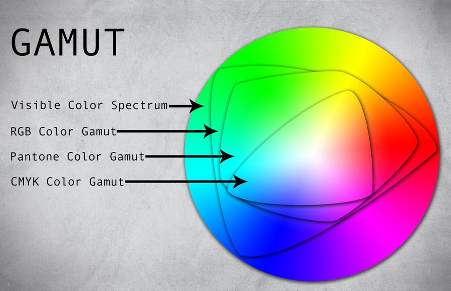
Spot colour printing features a larger colour gamut than process colours – see illustration below and many company logos can only be accurately reproduced using Spot colours. Unfortunately, the use of spot colours can be expensive therefore are generally used where colour accuracy is crucial.
Image source: Deviant Art
Process Colours
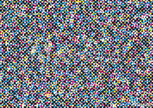
On the contrary, process colours are produced with a combination of the following four inks; Cyan (C), magenta (M), yellow (Y), and black (K), which is why it is commonly known as 4 colour process. The image to be printed is separated into four files each of one colour and these are printed on top of each other as a series of dots1 ,so close to each other that they appear as a solid colour to the human eye. The process colour is recorded as percentages of the cyan, magenta, yellow and black inks. Adjust the percentages of the four inks to produce colour variations. However, this method does offer a more limited number of colours in comparison with spot colours. Process colour printing is more cost-effective than spot colour printing as only the four inks are used.
Images: (left) CMYK dot pattern (source: Adobe stock), (right) spot colour
Limitations
As we have explained both spot and process colours have their limitations in the printing industry. Depending on the printing procedure or the texture of the printing material, spot and process colours are both commonly used. Sometimes both systems are used to print the same design if only one spot colour is necessary. In certain colour gamut areas your colour cannot be perfectly matched with CMYK alone. Thus, spot and process colour references are both indispensable for all designers and can be found available in many design software programmes, like Adobe InDesign. However, it is important not to rely on the on-screen colour if your screen is uncalibrated.
This is where a Pantone Guide would be useful! Some Pantone Guides, known as Color Bridges show both spot and process colours in the same book whereas the CMYK Guide only has process colours which do not relate to Pantone PMS spot colours.
Do I need a Pantone Color Bridge?
If you are working in the graphic design or printing industry or simply making critical colour decisions on printed media or packaging, a Pantone Color Bridge is a fantastic tool for you, offering many benefits. Available in a set of coated & uncoated or as individual guides you can select either coated or uncoated to suit the print media being used.
Image: Pantone Colour Bridge Coated & Uncoated
Use the Color Bridge if you are brand designers or are creating printed products in multiple materials. Brand colours are usually selected from Pantone spot colours, Color Bridge is crucial to avoid guesswork with the colour output. Check and provide your clients with information on how their brand colours will reproduce in 4 colour process. Thus enabling consistency with their labels, logos or marketing materials.
Pantone Color Bridges are used across various media, such as printing, videography, animation or web applications. Essential to help designers specify spot or process colour. Comprising two different columns of colour references, easily compare how a solid (spot) colour (left column) will be reproduced in 4 colour process (right column).
Image: Spot vs Process colour in Pantone Color Bridges
To ensure colour consistency across all types of media, the Pantone Color Bridge provides 3 different commonly used colour values. The solid colour has RGB values for video and animation and HTML values for web design under the spot colour. The CMYK values with the precise screen-tint percentages for instant and convenient reference are displayed under the process colour.
Image: RGB, HTML & CMYK values in Pantone Color Bridge
What if I need both the spot ink recipes and the CMYK codes?
Newly available is the Coated Combo Set GP6205B – ideal for homeworking and an economical alternative to buying both sets separately.
The Coated Combo Set includes Color Bridge coated and Formula Guide coated, giving you the best of both worlds. Providing access to all the Spot ink recipes as well as the RGB and HTML values for the spot colours, and the closest corresponding CMYK values.
Pantone Color Bridge or CMYK Color Guide?
We are often asked about the difference between the Pantone CMYK Guide Set and the Color Bridge Set.
CMYK Guides contain only colours which exist within CMYK colour space, 2868 colour variants with the CMYK percentages to enable confident use of 4-colour process colours in offset lithographic printing. If you only work with CMYK colours select colours from these guides with confidence that they can be accurately reproduced.
NB: This is a different system to the PANTONE PMS system and so it does not relate to Pantone Spot colours. If your clients select Pantone Spot colours and you are required to check the CMYK versions of these, you will need to purchase a Color Bridge Guide.
Pantone Color Bridge or Extended Gamut Guide?
Extended colour gamut (ECG) printing adds additional process inks to CMYK to extend the possible colour gamut. The most common additional base inks are Orange, Green and Violet (OGV) as these are the hues most difficult to reproduce with CMYK. Pantone did produce an Extended Gamut Guide using these seven colours, however it was discontinued in 2023. Each colour is displayed with both the ink percentages and as the RGB values.
Image: Pantone Extended Gamut Guide
Using Spot colours to match brand colours is the most reliable option but using extended gamut printing is the next best solution. It allows for 90% better Pantone Spot colour matches than by using CMYK alone. (Pantone, 2020)
Extended Gamut Guide will help you to achieve the best result for your client when your printer has seven process inks.
The Solid to Seven Set combines selected Spot colours from the Pantone Formula Guide coated with the Extended Gamut Guide. Consequently making it easier for you to compare the seven-colour process matches which correspond to the Spot colours.
Which Pantone book is the right one for you?
Need any further clarification about which Pantone guide is the right for you? Feel free to contact our Colour Experts at pantone@verivide.com or on +44 (0) 116 284 7790.
1. Pantone LLC (2020) Process color vs. Spot, or solid color, available from https://www.pantone.com/customer-service/help/?t=Process-color-vs.-Spot,-or-solid-color


