Do you include metallic in your artwork? If not, the following fact is going to be a revelation for you…
According to Global Market Insights (2018)*1 the use of metallic pigments will experience a 6.5% increase in Europe, USA and Asia, reaching over 2.3 million dollars by 2024.
Although the automotive industry shows the highest demand for metallics used in coatings, metallics continue to be a huge trend also for the packaging industry, especially for food and beverage packaging, for cartons in tobacco, in personal care products and cosmetics such as shampoo, nail varnish and eyeshadows or in pouches and gift wraps. The graphics industry is another significant market that tries to distinguish the creative artwork by utilizing metallics either in cardboard, labels or marketing and commercial collateral.
Grabbing consumers’ attention is difficult in this competitive market and more and more brands use metallics to create eye-catching and striking packaging and graphics artwork. However, there is a considerable gap between the demand for metallic colours and the actual offer from suppliers. Designers are seeking various metallic samples to provide to their suppliers as reference for what they want to produce but most of the time it is difficult to reproduce the colour they desire.
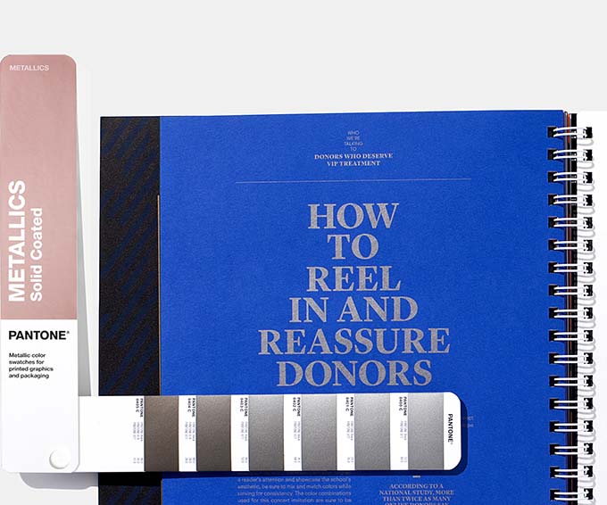
The lack of metallic colour reference guides inspired Pantone to create the Metallics range for Graphics and packaging industry. Pantone Metallics range is here to help designers achieve quickly and accurately the correct colour for metallic finishes.
“When a “finished” metallic look is properly executed, the reward far outweighs the effort put into development.” (Adrián Fernández, Vice president and General Manager at Pantone)
Although golds, silvers and bronze were and are the top metallic colours that conquer the design world, it is observed another growing trend in metallics of more pastels and neutrals hues that making design more impactful.
Following on from the trend in the past couple of years of wearing Rose Gold jewellery instead of white or yellow Gold this colour has been popular in packaging and Pantone brought out a new base ink, the Pantone 10412C, to help designers and printers to use it in their work.
Where you can use Metallics to make the product dazzling!
Now you know about 2019’s latest metallics trend and how to ensure the products you create are colour consistent with Pantone’s metallic collection, you will find below some tasteful colour combinations from Pantone on how to use the trend to give your brand a differentiating visual texture. Here are just some of the many, mesmerizing metallic design ideas out there.
Graphic Design
What better way to make your product stand out from the crowd than a little metallic? Colour is a vital part of the design process and should be one of the first elements up for consideration. Your colour selection should speak volumes about the message you wish to convey.
- Simple and Astonishing
Pantone has designed an understated and upscale combination of colours that will never go out of fashion. The cool and calming, tasteful teal pours confidence and the mid tone gray add an element of class and distinction. The rich copper metallic colour will bring warmth to your design that is sure to make your packaging design fly off the shelf.
(Source: Pantone, 2019)*2
Packaging Design
It’s pretty hard these days to catch the eye in the crowded environment of packaging design. Brands have a specific goal; to distinguish their packages on the shelf of shop stores, and require a stunning image from the packaging design, connecting directly with the consumers. The first few seconds of an impression are critical as they may be the only few seconds you get. Metallics create a luxurious feeling to the product, increasing the emotional association with consumers and helping brands to differentiate from their competitors.
The Premium Metallics of Pantone were developed to create this feeling of “luxury connotation” in packaging and at the same time they are more durable, better protecting the product on the shelf. Now with 54 new colours these “packaging” metallics have been combined with the PMS metallics into one guide https://store.pantone.com/uk/en/articles/technical/working-with-pantone-metallics-how-to-select-the-right-shine-for-graphics-and-packaging.html .
- Passionate and vibrant
This colour combination amalgamates elegance with urbanity. The vibrant pink celebrates the strength of the feminine in an unwavering empowered stance. The red metallic colour adds something different to the metals that are dominating the design arena.
(Source: Pantone, 2019)*2
- Sweet and calm
Combining sweet hues of rose and bronze with more dark silver-ish create a balance of elegance and simplicity in the packaging design. The light lavender background combined with brown-gold chocolate tones of ink can add a luscious result in the packaging.
(Source: Pantone, 2019)*2
Why to use Metallics in your design
- The 2019 metallic trend is here and it’s all about sophistication and style. The new trend sees design work become understated and minimalistic with statement metallic features being the focal point of 2019 design.
- Metallic printing in packaging is more cost-effective and saves precious time in the production in comparison with the application of metallics foil that require a more time-consuming procedure. Also, metallic ink printing is more environmental friendly, as it is completely recyclable in comparison with metallic foil stamping.
- Brands are willing to invest in more premium packages, and they know that Metallics provide a competitive advantage, differentiating them from their competitors. An impactful and sophisticated design with Metallics will attract instantly consumers’ attention.
“Leverage the power of color to tell your story will help you better engage and create strong emotional connections with your target audience”. (Laurie Pressman, VP, Pantone Color Institute)
Therefore, even if you want to create a feel of modernism, elegance, calmness or sophisticated style, Pantone Metallics will elevate your design, making an astonishing visual impact and empowering the sales of your clients.
Whether you are a graphic or packaging designer, brand manager, printer or ink manufacturer, the Pantone Metallics Guide is the perfect tool for all designers. Also, if you need to send colour chips to your clients or suppliers the Metallics Chip book has 6 tear out chips of all of the colours and replacement pages are also available if you should use up all the chips of your favourite colours.
Metallic Shimmers – The 2020 Fashion, Home & Interior Trend
In the Pantone Metallic Formula Guide and Metallics Chips Coated you will find everything you need, including 301 Commercial Graphics Metallics colours and 354 Packaging Metallics colours with index.
Sources*:
1. Global Market Insights (2018) Metallic Pigments Market Size By Product 2018-2024, available from https://www.gminsights.com/industry-analysis/metallic-pigments-market
2. Pantone (2019) Behind The Colors, available from https://www.pantone.com/color-intelligence/articles/colors/behind-the-colors-relevant-trend-palettes-for-graphic-and-packaging-design


