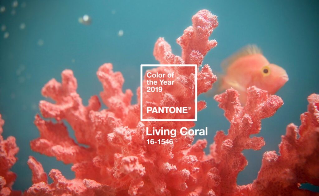
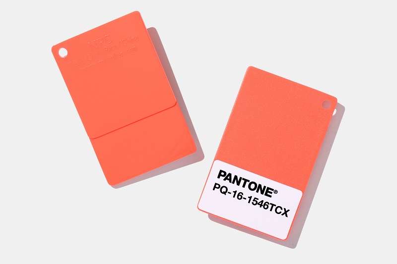
Pantone’s Colour of the Year for 2019 has been unveiled as Living Coral – and we’re excited to look at what it means and how it can be used in today’s modern world.
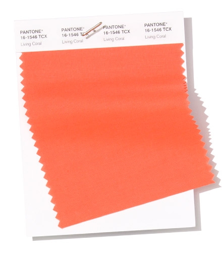
By choosing Living Coral 16-1546, which VeriVide highlighted in our top 10 colours for spring/summer 2019, Pantone wanted a colour “that is different and contains the element of surprise”.
An orange shade with a warm golden yellow undertone, Living Coral is a vivid colour that excites and comforts in equal measure.
A versatile hue, it fulfils our desire for warmth and comfort, yet it also provokes us to react to the onslaught of modern technology increasingly embedded in daily life.
Living Coral also encourages us to think about nature and the environment we live in, and conversely prompts us to think back to simpler times.
It is the perfect choice for Pantone’s Colour of the Year for 2019, and here we aim to demonstrate why.
Why was Living Coral chosen as Colour of the Year 2019?
Pantone chose Living Coral because it emits the desired, familiar and energising aspects of colour found in nature.
And there are a number of key reasons that influenced Pantone’s selection of Living Coral – a colour that mesmerises the eye and mind:
- Desire for warmth – In our quest to feel better and attain a measure of comfort amid all the continued unrest, uncertainty and instability in the global culture, we are reaching out to gather up all the warmth around us; seeking out materials with texture and colours that embrace
- Emotional connection – In response to the increased role technology plays in our life, consumers are seeking more immersive experiences, ones that allow them to feel, touch and hold something physical
- Energy from nature – This concept of warmth also speaks to the coral we see in the natural earth within tropical destinations (think sunset and floral) where we can submerge ourselves and bathe in the warmth offered, helping us in turn to feel naturally energised
- Retro, yet not – Colours from previous eras once considered retro are returning in more modern materials, silhouettes and tints/tones. Living Coral is one of those tones being re-visited, re-discovered and re-invented
- The environment – Focus on the environment continues to increase. We must pay attention to nature if our planet is to survive and flourish. Since 1970, one-third of the world’s coral reefs have died and another third are expected to perish by 2030
How Living Coral fits into today’s world
We’ve pored over the key reasons why Pantone selected Living Coral and, for us, what stands out is the link to nature, the environment and how Living Coral is an antidote to today’s tech-obsessed society.
Here, we’re going to delve a little deeper into those themes.
The environment
One of the first scenes imagined when you hear the words Living Coral are the coral reefs found all around the world.
While it may conjure up cute images of clown fish and scuba diving in tropical destinations, an important message is the impact their depletion is having on the environment.
It’s a serious, serious issue, and there are a multitude of factors that are putting the world’s coral reefs at risk, such as coral mining, pollution and overfishing.
They are having a devastating effect on marine life, millions of peoples’ livelihoods and homes, tourism. It’s an extensive and worrying list.
But, incredibly, there are many powerful people in the world who still do not take climate change seriously and even deny that it exists.
But Pantone’s choice of Living Coral can help highlight these worrying issues and bring the plight of coral reefs into the public conscience.
Lying at the centre of our naturally vivid and chromatic ecosystem, Living Coral is evocative of how coral reefs provide shelter to a diverse kaleidoscope of colour.
Energy from nature
For those of us currently immersed in the throes of winter, with driving rain, howling winds and, inevitably, snow, Living Coral offers some welcome respite.
It gives us the opportunity to think instead about sunnier climes, about tropical destinations that exude warmth and comfort.
Living Coral simply screams “tropical”, and it’s easy to imagine yourself lazing on a beach with the waves lapping at your toes, cocktail in hand.
That makes Living Coral, which is flattering to so many skin tones, the perfect colour for swimwear, especially women’s beachwear such as bikinis and swimsuits.
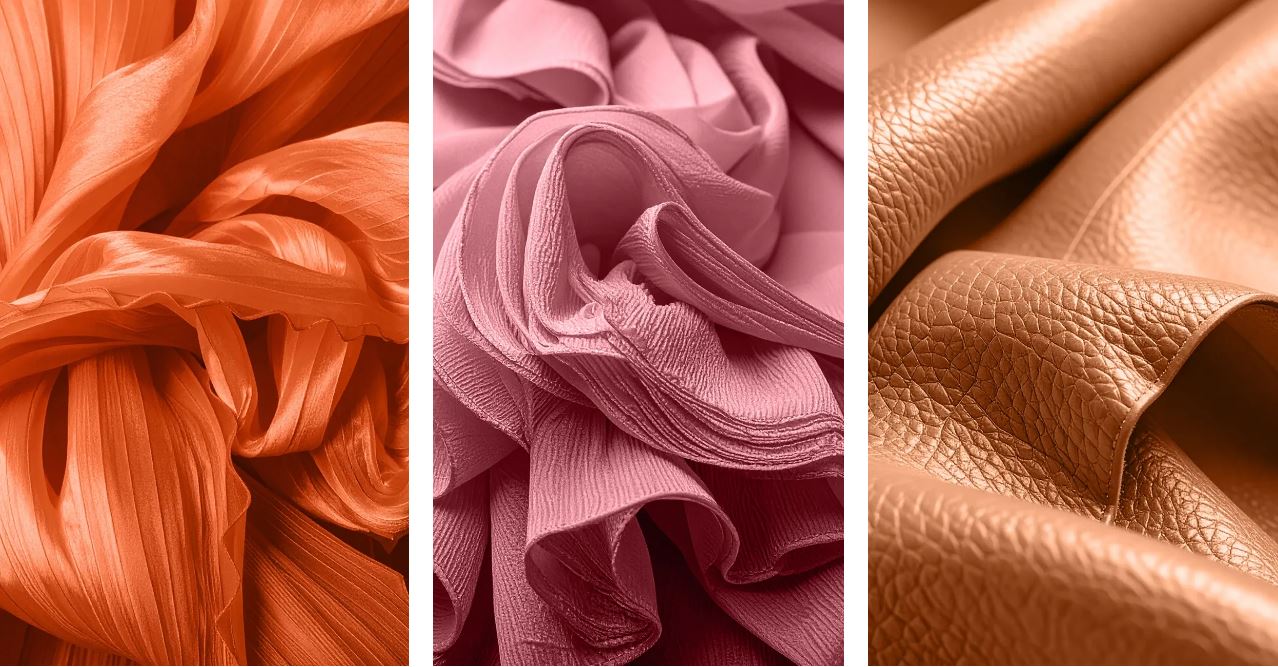
Living Coral is also the ideal accompaniment to tropical palettes, opening up a whole range of textile applications for bright, summery prints.
But it doesn’t just extend to clothing. Why not bring a touch of sunshine to your home with Living Coral in the shape of rugs, blankets and lush upholsteries create a warm, comforting and nurturing feeling.
Retro, yet not
We live in an increasingly digital, tech-based world – and it’s a world that can be grey and black, dull and uninspiring.
It needs a breath of colour injected into it, and what better antidote to all that greyness than Living Coral?
With all that tech comes social media – how many of us use Twitter or Instagram or Snapchat on a daily basis?
An organic shade, Living Coral is striking in digital mediums, evoking the same inspirational feeling ignited by our natural surroundings.
Living Coral’s vibrancy and buoyancy captivates our attention in social media and digital design
Colours from past eras are making a comeback. Retro is cool, and Living Coral is one of those tones that are being re-discovered to give us a welcome splash of colour.
Think back to the disco era, when colours like Living Coral were a staple tone of that period in fashion and furnishings.
It’s their time again, and Living Coral is the ultimate tone to have some fun with, to poke your tongue out at all those grey, techy colours that are all to prevalent in today’s world.
Designers can go wild with wacky shirts or trousers, patterned shoes or soft furnishing, all infused with Living Coral to give you a cool, retro look.
And it doesn’t stop there. There are plenty of out-there colour combinations that are the perfect accompaniment to Living Coral. Look to work in colours such as Pantone Barrier Reef (17-4530) for sumptuous accessories.
How to use Pantone’s 2019 Colour of the Year – Living Coral
In Fashion and Accessories Don’t be scared. Feel free to experiment with contrasting palettes and use Living Coral to bring dashes of effervescence to plain designs.
The nourishing shade suggests recovery and growth when used in muted palettes, but more playful and extrovert in busy patterns, raised textures and holds its own when used as monochrome.
Think about Living Coral when designing athleisure products, as an accent or monochrome.
In Beauty Living Coral is a flattering colour for a variety of skin tones. Customers can be confident that it will bring flattering colour to eyeshadow, lipsticks and glosses.
The brave are rewarded with stunningly colourful looks that can be adapted for parties, beaches and boardrooms. Using shimmers and highlights to varying effect can highlight the flexibility of Living Coral.
In Product Design Living Coral exudes warmth. Consumers desire welcoming tones and varied textures. Living Coral appeals to our desire for products that go beyond function and have a personality.
In Interior Décor and Furnishings Think bold. Living Coral is a statement colour that works just as well in small snappy accents as it does for feature walls and playfully coloured furnishings.
With its cheerful characteristics, Living Coral can bring drama to any setting. Think decals, wallpaper and small furnishings. The key learning for designers is that Living Coral encourages designers to dare to be different.
In Packaging Design Living Coral is ideal for packaging applications. The welcoming tone is well suited to tactile packaging that draws consumers in.
What Pantone say about the Colour of the Year 2019
Leatrice Eiseman, executive director of the Pantone Color Institute, said: “Colour is an equalising lens through which we experience our natural and digital realities and this is particularly true for Living Coral.
“With consumers craving human interaction and social connection, the humanising and heartening qualities displayed by the convivial Pantone Living Coral hit a responsive chord.”
Laurie Pressman, vice-president of the Pantone Color Institute, said: “Colour enhances and influences the way we experience life.
“As a shade that affirms life through a dual role of energising and nourishing, Living Coral reinforces how colours can embody our collective experience and reflect what is taking place in our global culture at a moment in time.”
How do I explore Pantone Living Coral even further?
We’ve given you an insight and a taste of Pantone’s Colour of the Year 2019, but you want to know more about Living Coral 16-1546? That’s easy.
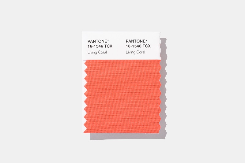
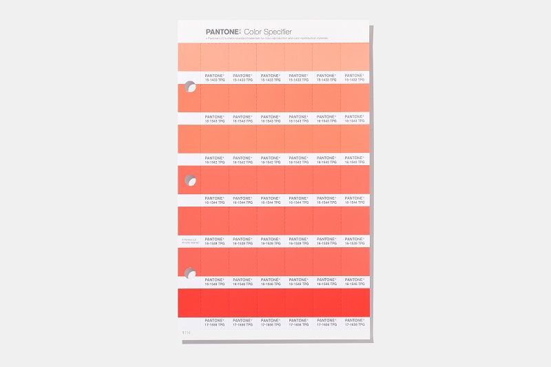
We want you to experience it for yourself, and there are various ways for you to get your hands on the Colour of the Year 2019. The colour can be found in all Pantone TCX books and TPG books as well as as individual Swatch Cards and Individual Plastic Chips
Also explore these useful products:
There’s so much more for you to browse at our online shop. If you have any questions, please contact us via email at enquiries@verivide.com or telephone on +44 (0)116 284 7790.
About Pantone and the Pantone Color Institute
Pantone LLC Incorporated is the global colour authority and provider of professional colour standards for the design industries.
Pantone products have encouraged colourful exploration and expressions of creativity from inspiration to implementation for more than 50 years.
The color selected as our Pantone Colour of the Year 2019 was taken from the Pantone Fashion, Home + Interiors Color System. This is the most widely used and recognised colour standards system for fashion, textile, home, and interior design.
For more information on the Pantone Colour of the Year for 2019, please click here.

